Blog · By The Packaging Vista Team · June 20, 2026
Vector vs. Raster: Which File Format for Packaging?
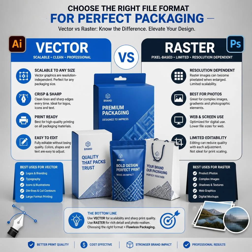
The vector vs. raster call is one of the most vital choices you make before printing. The file type you send decides whether your custom printed boxes for your product print crisp or blurry.
Getting it right is mostly about using vector art where you can and high-res raster images where you must. This post goes deeper than the file section of our main artwork and dieline guide. So you know exactly what print resolution your packaging design needs to hold up under custom printing at real box size.
What is vector artwork?
Vector files (AI, EPS, or vector PDF) are built from math paths, not pixels. So they scale to any size without losing sharpness. Blow a vector logo up to billboard size or shrink it onto a lip gloss box and the edges stay clean.
That makes vector the top pick for packaging. It is ideal for logos, type, and line art. It lets a print operator resize your mark to fit any panel with no quality loss. Vector is also how a printer separates spot colors and builds the cut path. That is why it is the gold standard for anything that must be sharp.
What are raster images?
Raster files (JPG, PNG, PSD, TIFF) are made of a fixed grid of pixels. So they blur, pixelate, or show jagged edges if you scale them past their native size.
Raster is the right pick for photos, textures, and gradients. Anything with smooth tone that vector cannot describe. The catch is resolution. Supply raster art at a minimum of 300 DPI at final print size, not pulled small from a website. A web image is often only 72 DPI and sized for a screen. So it will look soft and blocky once it is blown up onto a box.
Why does 300 DPI matter?
DPI (dots per inch) measures how many pixels fall into each inch of the printed area. At 300 DPI the dots are small and dense enough that the eye reads them as a smooth image. Below about 200 DPI you start to see softness. At web resolution the pixels become obvious.
The number that matters is DPI at final print size, not the raw pixel count alone. A 1000-pixel-wide image is plenty for a two-inch panel but far too small for a ten-inch one. When in doubt, design at the real size the art will print and check the effective resolution there.
Which format should you use when?
- Logos, text, icons — vector, always.
- Photos, gradients, textures — raster at 300 DPI or higher.
- Mixed designs — build a vector layout and place high-res raster images into it.
Vector vs. raster at a glance
| Attribute | Vector | Raster |
|---|---|---|
| Built from | Math paths | Pixels |
| Scales without quality loss | Yes, infinitely | No, blurs when enlarged |
| Best for | Logos, type, line art | Photos, textures, gradients |
| Common file types | AI, EPS, vector PDF | JPG, PNG, PSD, TIFF |
| Resolution rule | Resolution-independent | 300 DPI at final size |
What is the common web-logo mistake?
The most frequent file problem we see is a logo saved only as a small PNG or JPG pulled from a website or social profile. It looks fine on screen but turns soft and jagged once it is blown up onto a printed panel.
The fix is to use the real vector version of the logo. The file your designer first made it in. If that file no longer exists, do not enlarge the small image. It cannot recover detail that was never there.
What if you only have a logo?
If your logo exists only as a small web image, we can often redraw it as clean vector art as part of our free design help. Just ask. Once it is vector, it can sit crisp on a box of any size, get separated into spot colors, and be reused across every product you launch. See dieline templates for where the art goes on the box. And our bleed and safe zone notes for keeping it inside the print area.
How do you get colors right too?
File type controls sharpness. But color mode controls truth. Print uses CMYK and spot colors, not the RGB your screen shows. So a design that glows on a monitor can shift on press. Build or convert your art in CMYK. And spec Pantone references for brand-key colors. Our CMYK vs. Pantone guide covers when to use each so your printed box matches what you approved.
How do you package your files before sending?
Sharp art still needs to arrive intact. When you send a layout, keep the real editable vector file, not a flattened export. Either embed or outline your fonts so a missing typeface does not reflow your text on press.
Place high-res raster images at their full native size, not stretched up to fit. Include the colors you expect. CMYK build values and any Pantone references. And supply a PDF proof that shows how the final box should look.
Packing the files this way means fewer back-and-forth rounds, a cleaner first proof, and a printed box that matches what you approved. If your art is not press-ready, our free design help can prep it for you. Just flag what you are unsure about and send everything you have.
Frequently asked questions
What is the difference between vector and raster?
Vector art is built from scalable math paths and stays sharp at any size, while raster art is built from a fixed grid of pixels and blurs when enlarged beyond its native resolution.
What resolution do my packaging files need?
Vector art needs no set resolution because it scales freely. Raster images should be at least 300 DPI at the final print size; web images at 72 DPI are too low.
Can you fix a low-resolution logo?
Often yes. As part of free design support we can frequently redraw a small web logo as vector so it prints crisply at any size. Send us what you have and we will tell you.
What file formats should I send?
Send vector logos as AI, EPS, or vector PDF, and any photos or textures as 300 DPI raster files. A vector layout with high-resolution images placed in is ideal.
How do I choose between vector and raster for a specific box element?
Ask what the element is. Logos, wordmarks, icons, borders, and any hard-edged line art: vector, always – scales without blur and separates cleanly into spot colors. Photos, product shots, gradients, and textured backgrounds: raster at 300 DPI at final size.
Mixed layouts: build a vector layout in AI or Illustrator and place high-res raster images into it, so the type and logo stay sharp while photographs render smoothly.
What are the benefits of using vector artwork for packaging?
Sharp at any size (no blur when the same logo runs on a lip gloss box and a shipping mailer), clean separation into spot colors for offset printing, faster processing at press, easy re-use across every SKU in the line, and no resolution planning per file.
Vector is also how our team builds the cut path and finish layers (foil, spot UV, emboss) on your dieline, so vector art speeds prepress and cuts the risk of a soft, jagged print.
How much does it cost to have a low-res logo converted to vector?
Nothing, in most cases. Redrawing a small web PNG or JPG as clean vector art is part of our free design support – send us what you have and we will tell you whether a redraw fits within the free help or needs custom work. Once vector, the logo works across every future box order, so the one-time conversion pays back on every reorder and every new SKU in the range.
Which file format is best for a first-time custom box order?
A press-ready vector PDF or AI file with the logo, brand type, and any icons built as vector, plus any product photos placed at 300 DPI. If you do not have that, send the highest-resolution vector logo you have (ideally the original file from your designer) plus a rough sketch or reference photos of the look. Our free design team builds the rest on the dieline.
Is it worth the extra work to prep files properly before sending?
Yes – cleaner files mean fewer proof revisions, a first proof that already looks right, and a printed box that matches what you approved. It also avoids the classic reprint trigger: a small web logo enlarged to fit a lid, printing soft and jagged. If you are not sure, send everything you have and flag your uncertainty. Our free design help catches most file issues before press.
Related reading from OLX Packaging: packaging design mistakes to avoid.
Not sure what files you have? Send them and we will tell you exactly what we need. Start with our artwork guide, then request your free quote or contact our team.
Part of our custom box printing guide — the pillar reference for every custom box printing topic on this blog.