Blog · By The Packaging Vista Team · June 20, 2026
CMYK vs. Pantone: Getting Brand Colors Right in Print
Screens and presses produce color differently, so the color you approve on a monitor is not always what prints – unless you set it up right. A logo that glows on screen can land flat or shifted on a printed box, and a brand color that looks perfect in your design file can vary run to run if it is not specified correctly. This article goes deeper on color than our custom box printing guide and artwork and dieline guide, explaining CMYK, Pantone, and how to keep your brand color consistent across every box.
Why not RGB?
Screens use RGB (red, green, blue light), but presses use ink. Designing in RGB and printing it lets colors shift – often duller than the screen, because light can produce vivid hues that ink simply cannot mix. Always build packaging artwork in a print color model. If you start in RGB and convert at the end, expect the brightest blues, greens, and oranges to soften, so it is better to design in a print space from the outset and judge color against a printed proof rather than your monitor.
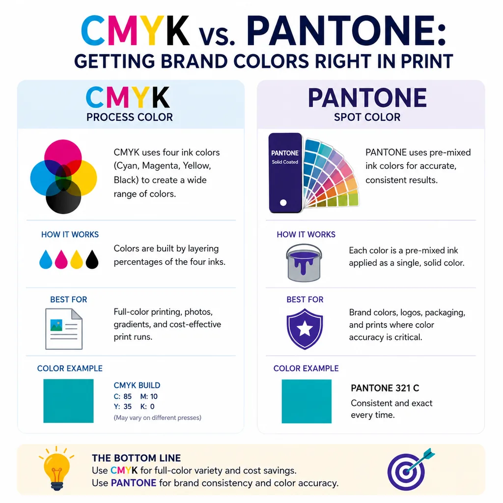
CMYK: the four-ink standard
CMYK (cyan, magenta, yellow, black) mixes four inks to reproduce full-color images and most colors. It is the standard for photos and multi-color artwork, and it is cost-effective. Because almost any artwork can be printed in CMYK, it is the default for boxes with photography, gradients, or many colors. The trade-off is that some specific colors – particularly bright, saturated brand hues – can drift slightly between runs, since they are built from a mix of four inks rather than one fixed ink.
Pantone: exact brand color
Pantone (PMS) spot colors are pre-mixed inks that reproduce an exact, consistent color every run – the safest choice for a specific brand color or logo. If your brand lives or dies on one exact color, specify a Pantone. Because the ink is mixed to a recipe before it ever touches the press, a Pantone red looks the same on this order as on your reorder next year. Spot colors also let you hit certain vivid hues that CMYK cannot reproduce cleanly.
CMYK vs. Pantone at a glance
| CMYK (process) | Pantone (spot) | |
|---|---|---|
| Best for | Photos, gradients, multi-color art | Exact brand colors, logos |
| Consistency | Can shift slightly run to run | Exact match every run |
| Color range | Broad, but misses some vivid hues | Hits specific bright/specialty colors |
| Cost | Economical for full-color work | Adds a dedicated ink |
Many boxes use both: CMYK for the imagery and one or two Pantone spot colors for the logo and key brand color.
How to keep color consistent
Build art in CMYK, and call out a Pantone reference for any color that must be exact. Tell us your Pantone and we match it on press, so every reorder looks the same. The single most reliable habit is to specify your brand color as a named Pantone in your brand guidelines, then reference that same code on every order – that way nobody is eyeballing a screen to recreate it. See finishes for how color and finish interact; matte, gloss, and soft-touch coatings can subtly change how the same ink reads.
Proofing before the full run
The safest way to confirm color is to look at it printed, not on a screen. Reviewing a proof catches a shifted hue, a too-dark photo, or a brand color that needs adjusting before you commit to the full run. Because lighting changes how color looks, judge a proof under consistent, neutral light rather than at your desk. As a US-based manufacturer, we proof the color and supply a layout to approve before printing, so there are no surprises on the finished box. For artwork setup that supports clean color, see our vector vs. raster guide and bleed and safe zone guide.
When to combine CMYK and Pantone
The two systems are not either/or – the strongest packaging often uses both. A common setup runs full-color CMYK for product photography or illustrated backgrounds, with one or two Pantone spot colors reserved for the logo and the single brand color that must never drift. This gives you rich imagery and a rock-solid brand color at once. Spot colors are also the route to effects CMYK cannot achieve, such as metallics or certain ultra-bright hues, which is why some premium boxes specify a metallic Pantone alongside process printing. Tell us how your artwork is built and we will advise which colors to hold as spot.
Finishes, stocks, and how they change color
The same ink can look different depending on what it is printed on and what is layered over it. Uncoated kraft absorbs ink and mutes color, while a coated white stock keeps it bright and saturated. A matte or soft-touch lamination slightly softens color, and a gloss coat deepens it; spot UV over a color makes it pop. Because of this, it is worth confirming your brand color on the actual stock and finish you plan to use, not just on a generic proof. Our box finishes guide covers how each coating interacts with print, and our paper weights and thickness guide explains how stock choice affects the look.
Frequently asked questions
Should I design my box in CMYK or Pantone?
Design in CMYK for full-color artwork and photos, and specify a Pantone for any color that must match your brand exactly. Many boxes combine both.
Why did my printed color look different from my screen?
Screens use light (RGB) and presses use ink, so colors can shift – usually duller – if artwork is built in RGB. Build in a print model and judge against a printed proof.
How do I make sure reorders match?
Specify your brand color as a named Pantone and reference that code on every order. We match the Pantone on press so each run looks the same.
Can you match my exact brand color?
Yes. Share your artwork and Pantone references and we proof the color before printing, so the finished box matches what you approved.
Get your brand color right
Share your artwork and Pantone references and we will proof the color before printing, on boxes built with a free dieline and no die or plate fees. Start with our artwork guide, then request your free quote or contact our team.