Blog · By The Packaging Vista Team · October 27, 2026
Why Does the Color of Your Cosmetic Packaging Boxes Matter? The Psychology, the Shelf, and the Pantone Decisions That Decide a Launch
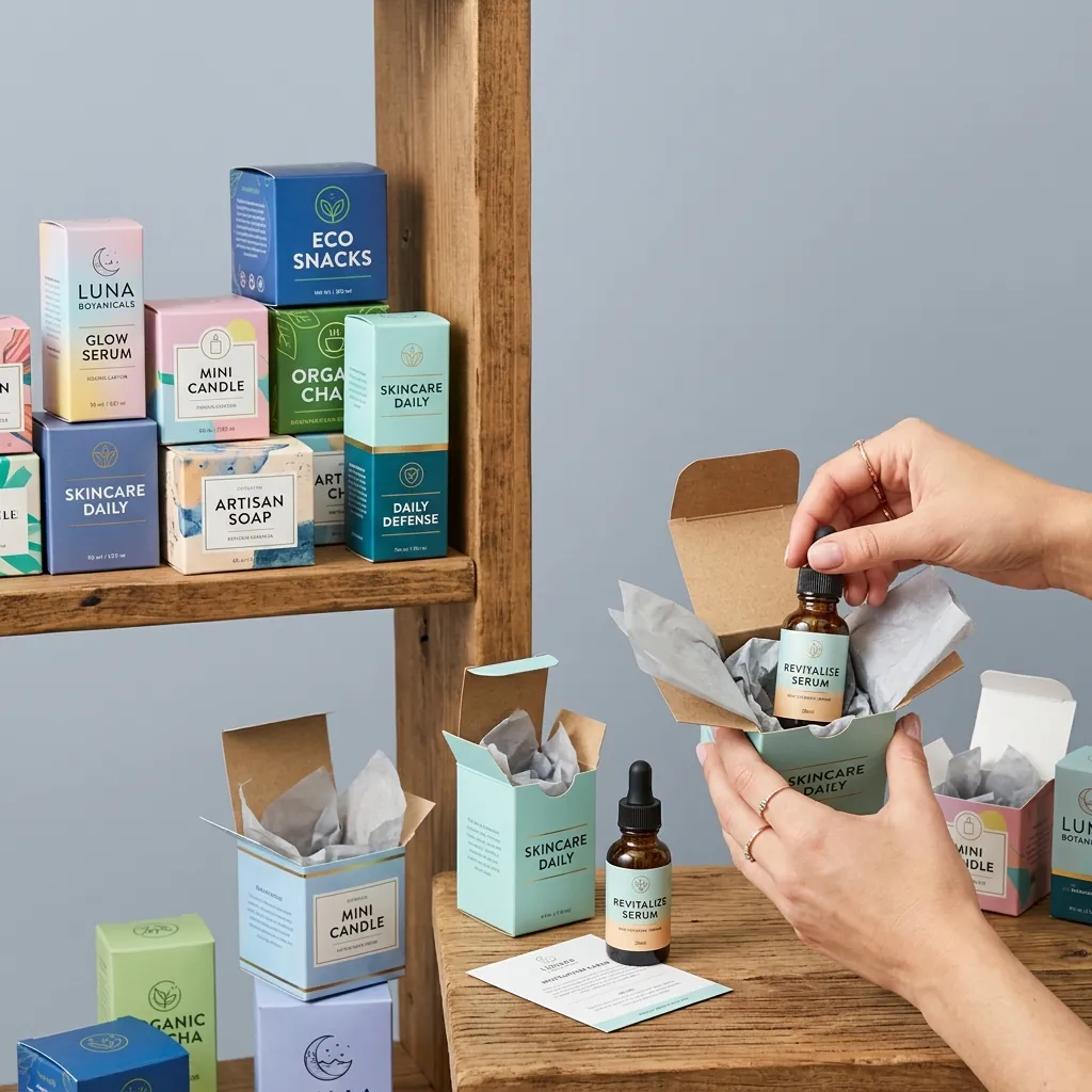
Color on a cosmetic packaging box isn’t decoration — it’s compressed brand strategy. Research on consumer behavior consistently finds up to 85% of initial buying decisions are influenced by color, and in cosmetics the effect is amplified because the category is color-coded by convention: black signals luxury, pink signals feminine mass-market, pastel green signals indie clean beauty, kraft signals natural, white signals clinical.
Pick the right color and the buyer categorizes your brand correctly in 1.5 seconds. Pick the wrong one and you fight the convention for the entire launch.
This guide walks the psychology, category conventions, demographic patterns, Pantone discipline, and production reality that decide whether your cosmetic box color works. Packaging Vista supplies custom cosmetic boxes, lipstick boxes, perfume boxes, skincare boxes, and the Pantone-matched print capability US cosmetic brands need before their first retail or Sephora/Ulta launch.
Key takeaways
- Up to 85% of initial buying decisions are influenced by color (Institute for Color Research). In cosmetics, the shelf-scan happens in 1.5 seconds — color does most of the categorization work.
- Category conventions compress brand positioning. Black = luxury; pink = feminine mass; pastel = indie clean; kraft = natural; white = clinical. Match 70% of panel to convention; differentiate with a signature accent.
- Pantone, not CMYK, for brand hero colors. CMYK percentages drift across suppliers; Pantone is reproducible.
- Delta-E tolerance in writing is the reprint lever. dE ≤ 2 or 3 on brand hero colors; anything above dE 5 is visibly off-brand.
- Test proof under retail lighting. Monitor ≠ retail shelf. 3500–4100K retail LED, 4000K+ Sephora/Ulta, 2700–3000K warm home light — colors read differently under each.
Why color carries so much weight in cosmetics
Three overlapping effects make color unusually load-bearing in cosmetic packaging:
1. The 1.5-second shelf scan
Cosmetic shoppers in Sephora, Ulta, or drugstore cosmetic aisles walk the shelf at 2–3 feet per second, with 1.5-2 seconds of attention per SKU zone. The eye registers color before shape, color before copy, and color before brand mark. Shoppers who are “just browsing” use color to filter the shelf: “I want something clinical” (eye to white and chrome); “I want something fun” (eye to color-block and neon); “I want something luxury” (eye to black and gold).
Mismatch your color to the buyer intent and you’re filtered out before the brand gets evaluated.
2. Color-emotion coupling
Decades of color-psychology research (Institute for Color Research, Pantone Color Institute) consistently find color-emotion associations that are stable across US and Western European consumer populations:
- Red: energy, passion, urgency, boldness — iconic lipstick packaging color.
- Pink: femininity, youth, sweetness, approachability — mass-market cosmetic default.
- Black: sophistication, luxury, authority, mystery — prestige cosmetic default.
- White: purity, clinical, trustworthy, minimal — dermatological and medicinal cosmetic default.
- Gold: premium, timeless, celebratory — luxury accent.
- Green (sage/forest): natural, organic, healing, calm — clean beauty default.
- Kraft/earth brown: natural, honest, artisan, sustainable — indie natural default.
- Pastel blue/mint: calm, soothing, hydrating — skincare and clean-beauty signal.
- Purple: creative, luxurious, mystical — often used in anti-aging and premium skincare.
3. Category coding
Within cosmetics, consumers learn category codes from repeated exposure. Red lipstick packaging is red. Clinical anti-aging is white and silver. Clean beauty is sage and cream. Luxury perfume is black and gold. Fighting these codes isn’t impossible — Glossier famously built a brand around millennial pink in a sea of clinical white and black — but it requires a budget and a brand positioning that explicitly contrasts with the convention.
Most SMB launches benefit more from matching than contrasting.
Color by price tier
Price anchors read partly from color before the sticker shock. The usable mapping:
| Retail price | Color signal | Finish | Channel |
|---|---|---|---|
| $8–$18 drugstore | Bright, high-contrast, color-blocked | Gloss, UV coating | CVS, Walgreens, Target drug |
| $18–$40 masstige | Refined palette, 1 signature color | Matte, soft-touch, spot UV logo | Sephora, Ulta mid, Target Beauty |
| $40–$120 premium | Restrained palette, deep neutrals + metal | Soft-touch, foil, deboss | Sephora, Ulta prestige, Nordstrom |
| $120+ luxury | Single hero color (black/burgundy/navy), foil | Rigid, magnetic closure, letterpress | Dept store counters, boutique |
Color by demographic
Color preferences skew by generational cohort in US cosmetics. Not deterministic, but useful at the design stage:
- Gen Z (born 1997–2012): high-contrast neon-plus-pastel, Y2K metallics, holographic, iridescent, chrome, lavender, lime green. Loud color choices read as authentic self-expression.
- Millennials (1981–1996): “millennial pink,” sage green, muted earth tones, soft minimalism, cream + terracotta. Low-contrast refined palettes read as sophisticated.
- Gen X (1965–1980): clinical whites, premium matte blacks, deep jewel tones, chrome accents. Classic + proven reads as reliable.
- Boomer (1946–1964): classic jewel tones (burgundy, forest green, royal blue), gold accents, warm cream, traditional luxury. Established prestige reads as quality.
Pantone discipline: specifying color that actually reproduces
The gap between the color you designed and the color you ship is the single most common cosmetic-packaging failure mode. Three disciplines close it:
1. Specify Pantone, not CMYK
CMYK percentages are process-color recipes that drift across suppliers, substrates, and press runs. Pantone colors are specified pigments. For brand hero colors (the one or two that are “yours”), spec Pantone references on the dieline. For luxury or premium cosmetic brands, consider Pantone metallics (Pantone 10xx series) or Pantone pastels (Pantone 9xxx series) for brand accents.
Pantone colors cost 10–25% more per color on a print run but reproduce faithfully.
2. Request a hard-copy printed proof
On-screen soft proofs and PDF proofs don’t show what’s coming off the press. A printed proof on the actual substrate (coated SBS, uncoated kraft, matte-laminated board) with the actual inks is $20–$80 and 2–3 days. View it under the target retail lighting condition (not just the design studio lighting). This is the moment to catch problems before the full-run spend.
3. Lock a Delta-E tolerance in writing
Delta-E (dE) is the industry-standard measure of color difference. For brand hero colors, lock dE ≤ 2 or 3 with the supplier in writing on the PO. The thresholds:
- dE 0–1: indistinguishable to the human eye.
- dE 1–2: perceptible only on close comparison.
- dE 2–3: perceptible to a trained eye in direct comparison; usually acceptable.
- dE 3–5: clearly perceptible; borderline.
- dE > 5: different color; reprint.
Written dE tolerance is the reprint lever if production drifts out of range.
The lighting trap
Color reads differently under different light sources, and most cosmetic designers don’t test for this. The three common failure modes:
- Design studio lighting (5000K daylight-balanced): colors look clean, saturated, true. This is the designer’s calibrated environment.
- Retail shelf (3500–4100K cool-white LED or fluorescent): warm colors shift slightly cooler; blues and whites look sharper; some reds look slightly muted. Standard US big-box retail lighting.
- Sephora/Ulta prestige section (4000K+ high-CRI LED): designed to show makeup accurately; cosmetic packaging is seen under conditions close to design studio lighting.
- Home mirror lighting (2700–3000K warm): packaging turns warmer. The buyer takes the box home and the color doesn’t match the Sephora display.
The fix: request your hard-copy proof under the actual target lighting condition before approving production. For Sephora/Ulta launches, use a 4000K+ LED viewing booth; for drugstore launches, use 3500K cool-white; for luxury department-counter launches, use 3000K warm-white.
Common cosmetic color mistakes
- Picking a color that fights the category convention without a brand reason. White drugstore lipstick in a sea of pink doesn’t read as differentiated — it reads as off-category and gets filtered out.
- Specifying CMYK percentages for brand hero colors. Reproduction drifts; the pink you designed is not the pink that ships.
- Skipping the hard-copy proof. Monitor and PDF don’t show press-print reality. Full-run reprints cost 100x the proof fee.
- Not testing under retail lighting. Approving a proof in a design studio and launching into a drugstore aisle is a lighting mismatch that colors notoriously fail.
- Over-indexing on trend colors. Trend colors (lavender was 2023; coquette pink was 2024) date fast. Use trend colors as seasonal variants, not as permanent brand colors.
- Mismatching color to price tier. Neon drugstore palette on a $90 serum reads as cheap; black luxury palette on a $14 drugstore lipstick reads as off-category.
Winning color strategies by brand position
- Mass drugstore (CVS, Walgreens, Target drug): bright pink, red, teal, color-blocked, high-contrast, gloss finish. Match the category pink-and-red convention; differentiate on shape or finish.
- Masstige (Sephora/Ulta mid): millennial pink + white, sage + cream, muted earth tones. One signature color against a neutral; soft-touch finish; spot UV logo.
- Premium Sephora/Ulta prestige: matte black with gold or chrome, deep burgundy, navy. Restrained palette; foil accent; deboss.
- Luxury department store: single hero color (classic black, deep red, dark burgundy, forest green, navy); heavy foil detail; rigid box with magnetic closure.
- Indie clean beauty: sage green, pastel pink, kraft brown, cream, terracotta. Natural tones; soft-touch finish; natural-feeling substrates (kraft or recycled board).
- Clinical/dermatological: white with pale blue or chrome accents; sharp sans-serif typography; glossy finish on the color-block, matte on the background. Clean, medical, trustworthy.
- Gen Z-targeted: high-contrast neon + pastel, Y2K metallics, holographic foil, iridescent chrome. Loud and unapologetic.
Frequently asked questions
What is the most popular color for cosmetic packaging?
Pink dominates mass-market cosmetics (feminine, approachable, youth-signal), followed by black for luxury and prestige, white for clinical/dermatological, and sage/cream for indie clean beauty. The “right” color is category-specific; pink isn’t default — the convention of your category is.
Does cosmetic packaging color really affect sales?
Yes. Up to 85% of initial buying decisions are influenced by color (Institute for Color Research). In cosmetics, where shelf-scan is 1.5 seconds and category coding is strong, color effects on conversion are typically larger than for most other categories.
What color signals luxury in cosmetic packaging?
Black is the primary luxury signal in US cosmetics, often with gold foil accents. Deep burgundy, dark navy, forest green, and dark purple also read as luxury. The signal is less about the color itself and more about the restraint of the palette (single hero color, minimal secondary, high-quality metallic accent).
What color should I use for a clean beauty brand?
Sage green, cream, pastel pink, kraft brown, terracotta, and matte white are the current clean-beauty palette. Match the convention; differentiate with typography and substrate (kraft, recycled board, textured paper).
What’s the difference between Pantone and CMYK for cosmetic packaging?
CMYK is a four-ink process color recipe that drifts across suppliers, substrates, and press runs. Pantone is a specified pigment that reproduces faithfully. For brand hero colors, spec Pantone. For process colors in photographic imagery and secondary elements, CMYK is fine.
How do I know my printed color will match my design?
Three disciplines: (1) specify Pantone, not CMYK, for brand hero colors; (2) request a hard-copy printed proof on the actual substrate before production; (3) lock a Delta-E tolerance (≤ 2 or 3) in writing with the supplier. Any supplier willing to accept all three terms is reliable.
Should my packaging color match my product color?
Not always. Lipstick in red packaging is category convention. Blue eye-shadow in blue packaging is on-nose but limits SKU-family consistency (every variant needs a different box). Many brands run a single brand-color package system with the actual product-shade shown on a label or window; others color-code variants. Both work; pick the one that supports your SKU family math.
Do cosmetic packaging colors differ by demographic?
Yes. Gen Z gravitates to high-contrast neon-plus-pastel, Y2K metallics, and holographic finishes. Millennials to muted earth tones and millennial pink. Gen X to clinical whites and premium matte blacks. Boomers to classic jewel tones and gold accents. Not deterministic, but useful at the design stage.
What color should I avoid in cosmetic packaging?
Colors with strong negative category associations: brown that reads as dirty rather than earth-tone, muddy olive green that reads as unhealthy, high-saturation yellow that reads as cheap or warning-adjacent, and any color that fights the category convention without a brand reason. “Avoid” is less a universal rule and more a convention-check.
How much does Pantone printing cost vs CMYK?
Pantone spot colors typically add 10–25% to print cost per color on a short-run litho job, and 15–30% on flexo. The premium is worth it for brand hero colors where reproduction fidelity matters; standard CMYK is fine for photographic imagery and secondary elements. On digital print, Pantone emulation is often included at no premium with modern 7-color (CMYKOGV) presses.
The bottom line
Cosmetic packaging color isn’t decoration — it’s compressed brand strategy that does 1.5 seconds of category-signaling, demographic-targeting, price-anchoring, and emotion-triggering work before the buyer reads a word of copy. Up to 85% of initial purchase decisions are influenced by color, and in cosmetics the category coding (black=luxury, pink=mass, pastel=indie clean, kraft=natural, white=clinical) is strong enough that color is usually the most load-bearing design decision.
The path to a color that works is match the category convention for 70% of the panel, differentiate with a signature accent, lock Pantone references on brand hero colors, test a hard-copy proof under target retail lighting, and secure a Delta-E tolerance in writing with the supplier.
Packaging Vista supplies custom cosmetic boxes, lipstick boxes, perfume boxes, skincare boxes, and the Pantone-matched litho and digital print capability US cosmetic brands need before launch — 100-unit minimum, no die or plate fees, free dieline and design, hard-copy printed proofs on request, Delta-E tolerance guaranteed, and 8–10 business-day production.
Request a quote with your Pantone references, target retail channel, and demographic and we’ll spec the color, finish, and substrate combination that puts your brand in the right 1.5-second shelf-scan category.