Blog · By The Packaging Vista Team · June 20, 2026
Minimalist Packaging Design: Why Less Sells More

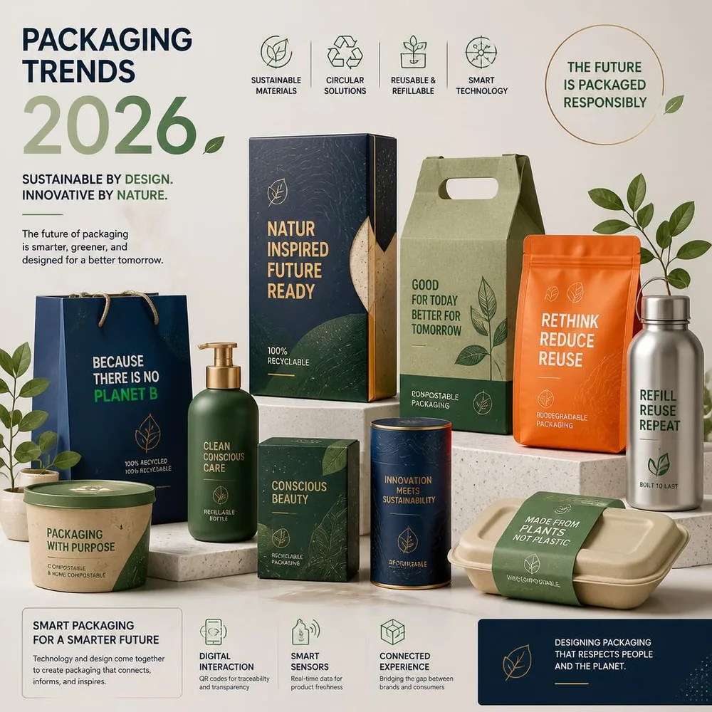
Minimalist packaging – clean layout, generous space, and one focal element – reads as premium and survives the small thumbnail of an online listing. Done well, minimalist packaging design proves that less really does sell more: it looks more confident, prints more cheaply, and travels better across shelf and screen than a busy, cluttered alternative. This article goes deeper on the design trend than our packaging trends guide.
Why minimalism works
Less clutter reads as more confident and more premium. On a crowded shelf, a clean package stands out precisely because everything around it is shouting. Online, simple packaging stays legible when it is shrunk to a thumbnail in a search result or marketplace grid – the moment most purchase decisions actually happen. Restraint signals a brand that knows exactly what it is and does not need to over-explain. That quiet confidence is what shoppers read as quality.
The psychology of empty space
Empty space is not wasted space – it is the most underused tool in packaging design. Negative space frames your focal element, gives the eye somewhere to rest, and makes the few things you do show feel deliberate and valuable. Luxury brands have understood this for decades: the more breathing room around a logo, the more important that logo feels. When everything competes for attention, nothing wins; when one thing has room to stand alone, it commands the panel.
How to do it well
- One focal point – usually the logo or product name. Let it breathe instead of surrounding it.
- Limited palette – one or two colors, often on a clean white or natural kraft board background.
- One hero finish – a single foil or spot-UV detail does more than several; see finishes.
- Generous space – empty space is a design choice, not a gap to fill.
- Restrained type – one or two typefaces, set cleanly, beats a stack of competing fonts.
Where the hero detail goes
Minimalism does not mean plain – it means choosing one thing to be special. Because the rest of the design is quiet, a single premium touch carries enormous weight. A debossed logo on uncoated stock, a slim foil line, a soft-touch surface, or one spot-UV accent against a matte field all feel luxurious because nothing else is competing. The discipline is to pick one hero detail and resist adding a second. For ideas, see our finishes guides on embossing and debossing, foil stamping, and spot UV.
Material as part of the message
In minimalist design the material itself does a lot of talking, so choose it deliberately. Uncoated and natural stocks signal honesty and craft; bright white board reads clinical and modern; kraft reads warm and sustainable. Because there is little artwork to hide behind, surface texture and color become front and center. This is also where minimalism and sustainability often meet – a clean, low-ink design on recyclable board tells a coherent story. See our packaging materials guide and sustainable packaging guide.
It can cost less, too
Fewer colors and simpler print often lower the price as well – minimalism and budget can genuinely align. A one or two-color job on uncoated stock with a single finish is typically cheaper to produce than a full-bleed, multi-finish design, and it tends to age better too. See our how to reduce packaging costs guide for the full picture on where the money goes.
Common minimalist mistakes
Minimal does not mean lazy. The most common failure is leaving out the information that legally or practically has to be there – required claims, net contents, or usage details – in the name of clean design. Plan those in from the start so they sit comfortably rather than getting crammed on later. The second mistake is mistaking emptiness for design; true minimalism is carefully composed, with intentional alignment and proportion, not just a logo floating on a blank box. The third is over-cropping a logo so small it disappears on a thumbnail – test your design at listing size before you commit.
Where minimalism fits best
Clean design travels especially well in premium beauty, supplements, food, and modern DTC brands where the audience equates simplicity with quality. It works across structures too – from a rigid box for a hero product to an everyday folding carton box or a printed mailer shipping box. The structure stays consistent; the restraint is what makes it feel high-end regardless of category.
Building a minimalist system, not a one-off
Minimalism scales best when it is treated as a system rather than a single design. Settle on a small set of rules – one logo placement, a fixed palette, a single typeface family, and one hero finish – and apply them across every SKU and box size. The payoff is a product line that looks unmistakably like one brand on a shelf or in a feed, even as the individual products change. It also speeds up future packaging: once the system exists, a new product slots into it rather than needing a fresh design. A consistent, restrained system is what separates a brand that merely looks clean from one that looks established.
How we help with minimalist design
Restraint takes discipline, and our free design support is built to help you find it. Send us your logo and a sense of the feeling you want, and our team lays out a clean, balanced design with intentional spacing – then sends a proof and a 3D mockup so you can see the box before it prints. We will also flag where required information needs to live so it stays legible without cluttering the front face. With no die or plate fees, a 100-box minimum, and both offset and digital printing, a premium minimalist look is achievable at low quantities, not just large runs.
Frequently asked questions
Does minimalist packaging look cheap?
Quite the opposite when it is done with intention. Clean layouts, quality stock, and one well-chosen finish read as premium. It looks cheap only when it is under-designed rather than deliberately restrained.
Is minimalist packaging cheaper to produce?
Often, yes. Fewer print colors and a single finish usually cost less than a busy, multi-finish design. See our cost-reduction guide.
How do I keep required text without clutter?
Plan mandatory information in from the start and give it a clean, secondary placement – often a single tidy panel – so the front face stays uncluttered.
Will a minimalist design work on a small online thumbnail?
Yes, that is one of its strengths. A single focal point and high contrast stay legible when shrunk. Always preview your design at listing size before approving.
Tell us your brand and we will lay out a clean, confident design with a free dieline and free design support – no die or plate fees, a 100-box minimum, and an 8–10 day turnaround. Start with our trends guide, then request your free quote or contact our team.