Blog · By The Packaging Vista Team · June 20, 2026
Embossing & Debossing: Adding Texture to Your Box
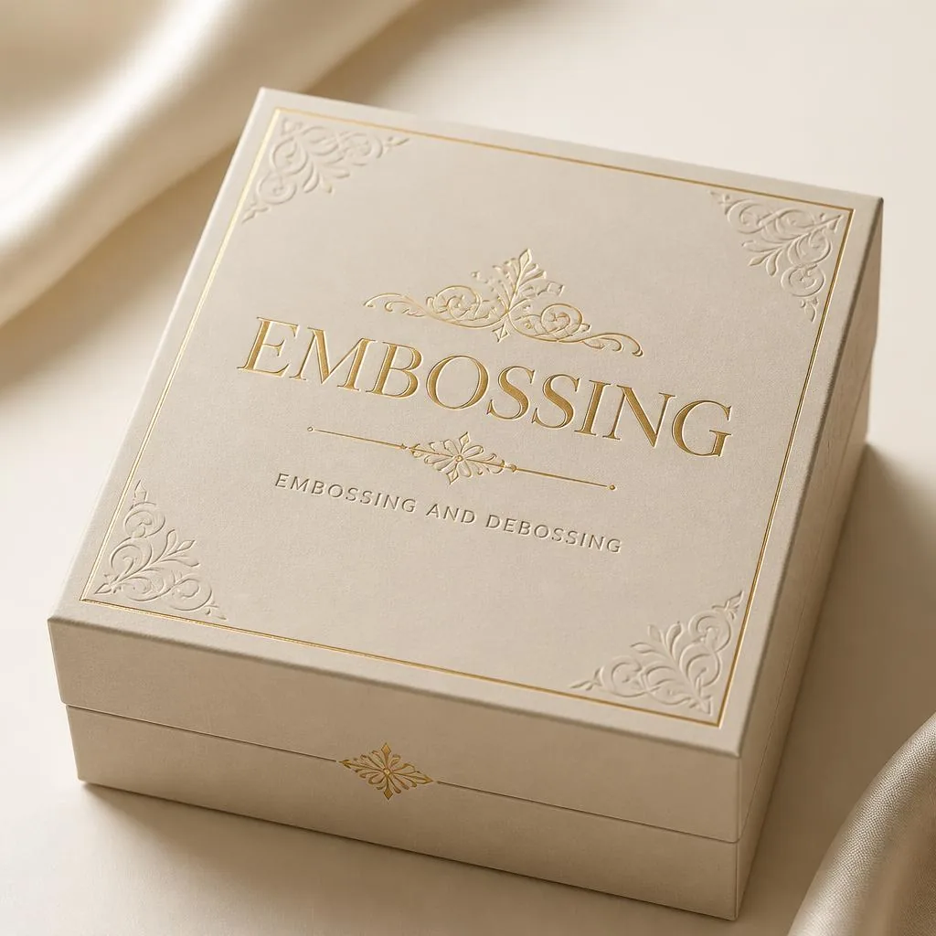
Embossing raises part of the box. Debossing presses it in. Both give a tactile, 3D effect buyers feel as much as see. They are the finish you reach for when you want a logo to stand out. An embossed or debossed mark adds a sense of craft that flat print alone cannot.
This guide to embossed packaging, the blind emboss, and the raised logo goes deeper than our main box finishes guide.
What is the difference between embossing and debossing?
Embossing pushes the board up. The design stands proud of the surface. That is great for a logo you want noticed. Debossing presses the design down into the surface. It gives a softer, stamped-in look.
Both use a custom die and pressure. The difference is purely directional. Emboss comes toward you. Deboss steps away from you. Which one to pick comes down to the effect and the stock.
- Embossing catches light on its raised edges. The mark reads from across a room.
- Debossing reads as quiet and sure. It sits flush, so nothing snags in handling.
- Both work best on a single bold element — a logo, monogram, or short brand name. Fine text does not hold up.
How does the process work?
A metal die is cut to the shape of your design. It is pressed into the board under heat and pressure. That reshapes the fibers so they hold the new form for good.
For embossing, a matched male and female die set sandwiches the stock to push it up. Debossing presses it down. The effect is mechanical, not printed. So it never fades, smudges, or wears off. The texture is the board itself.
What is a blind emboss versus a combination emboss?
A blind emboss uses no ink or foil. Just the raised shape and shadow. It is a quiet, minimal choice. Pick it when you want subtle luxury and let the stock speak.
A combination emboss adds foil or print on top of the raised area. That gives a raised metallic logo. It is the most premium effect on offer. A favorite in beauty and spirits packaging.
| Effect | Look | Best for |
|---|---|---|
| Emboss | Raised above surface, catches light | Logos that need to read from a distance |
| Deboss | Pressed into surface, flush finish | Quiet luxury, monograms, seals |
| Blind emboss | Raised, no ink or foil | Minimal, texture-led premium cartons |
| Foil + emboss | Raised metallic mark | Beauty, spirits, luxury gift |
| Spot UV + emboss | Glossy raised element on matte | Contrast-driven cosmetic and CBD packs |
| Emboss on soft-touch | Velvety base, raised accent | Unboxing-focused beauty and tech |
Which stock should you choose?
The thicker and stiffer the board, the cleaner and deeper the mark holds. Heavy paperboard and the wrapped board on rigid boxes take a crisp emboss. Thin or heavily coated stocks can crack at the edges of a deep press.
Uncoated and textured papers show a blind emboss well. That is because the shadow does the work. If you are not sure, our paper weights and thickness guide covers how stock weight shapes the result. We also proof every job before we print.
When should you use it?
Embossing and debossing shine on logos and monograms. Especially on rigid boxes and premium cartons where the tactile cue backs up the quality feel. They work well over a soft-touch base too. The velvety surface meets the raised mark for a high-end contrast.
Common uses:
- A raised brand name on a custom printed cosmetic box or luxury custom perfume box.
- A debossed monogram on a custom rigid jewelry box or premium custom gift box.
- A blind-embossed seal on a luxury carton where less is more. See our luxury packaging guide.
Where does embossing add the most value?
The tactile cue does its best work where a buyer holds the box long enough to notice it. Think of packs that get picked up, turned over, and kept. Keepsake custom gift boxes, elegant printed cosmetic cartons, premium scented soy candle boxes, and custom skincare cream boxes all fit.
The raised or recessed mark reads as quality before the buyer has read a word. On fast-moving shelf goods, it matters less. Shoppers do not hold the box long enough to feel it. So the budget is often better spent on bold print. Save the emboss for the touch-and-keep tier. That is how you get the most from the finish.
How does embossing fit a budget?
Embossing needs a custom die and an extra press pass. So it is a finishing step, not a default. The good news: we charge no die or plate fees.
The main task is to keep the design clean enough to emboss well. One strong element. A stock heavy enough to hold the press. A proof before the run. That keeps the effect crisp and the cost in check. If you are weighing where to invest across finishes, our box finishes guide and luxury packaging guide show how embossing stacks up against foil, spot UV, and soft-touch.
How do you pair embossing with other finishes?
Embossing rarely travels alone on premium work. The most requested pair is foil over an emboss for a raised metallic logo. But it also mixes well with spot UV for a glossy raised mark. Or with a soft-touch laminate for tactile contrast.
Want to compare premium print effects head to head? Our spot UV vs. foil post lays out where each one wins. The key is restraint. One strong effect on one element reads as luxury. Too many compete and cheapen the look.
Frequently asked questions
What is the difference between embossing and debossing?
Embossing raises a design above the surface of the box so it stands out; debossing presses the design down into the surface for a stamped-in look. Both use a custom die under pressure and create a tactile, three-dimensional effect.
What is a blind emboss?
A blind emboss is an embossed design with no ink or foil applied – the effect comes entirely from the raised shape and the shadow it casts. It is a minimal, elegant choice that lets the material and craftsmanship speak for themselves.
Can you combine embossing with foil?
Yes, and it is one of the most premium effects available. A combination emboss adds foil or print on top of the raised area to create a raised metallic logo. We proof the registration before printing so the foil sits perfectly on the emboss.
Are there extra die or plate fees for embossing?
No. We charge no die or plate fees, including for the custom emboss die, and produce from a low minimum of 100 boxes with an 8–10 day turnaround.
Why is embossing worth adding to a premium box?
The tactile cue does work before the buyer reads a word. A raised logo or debossed monogram signals craft and quality by the way the box feels in the hand, and the effect is mechanical rather than printed – it never fades, smudges, or wears off.
On packs that get held, turned, and kept (gift boxes, jewelry, luxury cosmetic, keepsake spirits), that lasting texture is what justifies the price and drives reorders.
How do I choose between emboss, deboss, and blind emboss for my logo?
Pick embossing when you want the mark to catch light and read from across a room – classic for beauty and spirits. Pick debossing when the design should feel quiet, flush, and premium – and when nothing should snag in handling. Pick blind emboss (no ink or foil) when the stock is beautiful on its own and restraint is the brand voice – kraft, uncoated cotton, and heavy textured papers all show blind embossing well.
What are the benefits of embossing over just printing a logo?
It never wears off, catches light in a way flat print cannot, adds real tactile value that photographs well in unboxing content, and reads as craft rather than mass-produced. It also lets a single-color kraft or uncoated stock feel premium without adding another ink pass.
And because we charge no die fees, the entry cost at 100 boxes is small relative to how much perceived value it adds to a luxury pack.
How much does embossing cost on a custom box?
Pricing is quote-based and depends on die size, stock thickness, and quantity. There are no die or plate fees at the 100-box minimum, so the incremental cost per box is small – usually less than adding a fourth print color to the run. A single emboss on a logo costs less than a combination emboss with foil overlay.
Heavier stocks hold the press cleaner, so a good emboss usually pairs with 18pt+ SBS or a rigid wrap.
Which finish combination is best with embossing?
Emboss with foil overlay for a raised metallic logo is the most-requested premium mix – classic on prestige beauty, jewelry, and spirits. Emboss over a soft-touch base gives a velvety-luxe contrast where the raised mark reads dimensional against the matte. Blind emboss on uncoated kraft signals artisan restraint. Skip spot UV plus emboss on the same element – they fight for the same visual weight.
Is embossing worth adding to a folding carton, or should I save it for rigid boxes?
Both work, but the effect is more dramatic on rigid boxes because the heavy wrapped board holds the press cleanly and the box gets held longer. On folding cartons, save the emboss for the hero element (usually the logo on the lid) and use a stock at least 18pt so the mark stays crisp through fold and glue.
For fast-moving retail where the box is grabbed and dropped in a cart, budget usually goes further on bolder print than on emboss.
For more on this topic, see luxury packaging design trends from OLX Packaging.
Tell us which element you want raised on your custom printed packaging boxes, and we will proof it before printing – no die or plate fees, from a 100-box minimum. See the full finishes guide, then request your free quote or contact our team.