Blog · By The Packaging Vista Team · October 27, 2026
Bento Box Graphic Design: Grid Layouts for Modern Packaging, Social Media, and Brand Systems
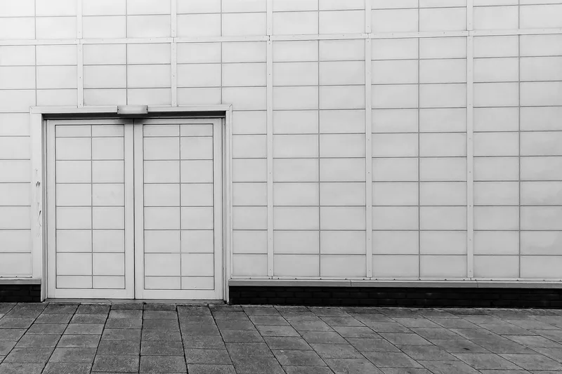
Bento box graphic design is a layout style built on a modular grid of asymmetric rectangles — inspired by the compartments of a Japanese bento lunch box — used to arrange content, imagery, and typography into cleanly separated cells that read as one unified system. The trend hit mainstream design in 2023 with Apple’s iOS, Vision Pro, and macOS product pages, and by 2026 it is the default layout language for product landing pages, pitch decks, dashboards, and — increasingly — packaging artwork, back-of-pack panels, and multi-SKU brand systems.
In packaging specifically, a bento grid turns a crowded back panel (ingredients, directions, warnings, barcode, QR, net weight) into a readable modular layout where every panel element gets its own cell.
Quick answer
- Bento box graphic design = a modular grid of asymmetric rectangles (cells) that arranges content into cleanly separated panels, inspired by Japanese bento compartments.
- Why it works for packaging: turns a crowded back panel (ingredients, directions, barcode, QR, warnings) into a readable modular layout; makes multi-SKU brand systems visually unified; reads cleanly on mobile and shelf alike.
- Core rules: 3–5 column grid, 8–16px gutter (3–6mm on-pack), rounded corners (8–24px / 2–5mm), each cell holds exactly one idea, one hero cell per layout.
- At Packaging Vista: we build bento-grid dielines and back-panel layouts into the free dieline on every 100-box order — no die, plate, or setup fees.
What is bento box graphic design?
Bento box graphic design is a layout style that uses an asymmetric modular grid of rectangles — each with rounded corners and uniform gutters — to organize content, imagery, and typography into visually separated cells that still read as a single composition.
The name comes from the Japanese bento, a lunchbox partitioned into small compartments where rice, protein, pickles, and vegetables are kept visually and physically separate but presented together.
The style formalized in web design around 2022–2023 (Apple’s iPhone 15 and Vision Pro landing pages are the canonical references) and has since spread to pitch decks, dashboards, social-media carousels, print editorial, and packaging. The core move: instead of one dense column of mixed content, split the composition into 5–10 cells, each holding one piece of information, with the cells sized and positioned to create a readable visual hierarchy — big cells for hero content, smaller cells for supporting detail.
Why bento is a graphic design trend
Four reasons bento became dominant in 2023–2026:
- Mobile-first readability. A single-column mobile layout stacks bento cells vertically; a wide desktop layout tiles them horizontally. The same content ships to any screen size without reflowing.
- Scannability. Each cell is a self-contained idea with its own border and background — readers scan the hierarchy in seconds instead of reading linearly.
- Modularity for brand systems. Different product SKUs can share the same bento template and swap only the hero cell — keeping brand consistency across a line while differentiating individual products.
- AI compatibility. Bento layouts are easy to generate algorithmically. Figma plugins, AI design tools (Firefly, Pacdora, Canva Magic Studio), and templating engines produce bento layouts from structured content in seconds.
Bento box graphic design style: the 7 core rules
Every bento layout — packaging, web, deck, social — follows the same seven rules:
- Modular grid (3–5 columns) — cells align to a shared underlying grid, usually 3 or 4 columns on packaging and 4–5 columns on desktop web. The grid is invisible; the cells are the visible layer.
- Rounded corners — every cell has rounded corners (8–24px on web, 2–5mm on-pack). Square-corner cells read as a table; rounded-corner cells read as bento.
- Uniform gutters — the gap between cells is the same size everywhere (8–16px on web, 3–6mm on-pack). Non-uniform gutters break the modular feel immediately.
- Asymmetric sizing — cells vary in size: one hero cell takes 2x2 units, three mid cells take 2x1, five detail cells take 1x1. If every cell is the same size, the layout reads as a tile grid, not a bento.
- One idea per cell — each cell holds exactly one piece of content: one headline, one icon with a short label, one chart, one product photo, one testimonial. Cells with multiple ideas crack the hierarchy.
- Clear visual hierarchy — one hero cell dominates (biggest or most saturated), then a secondary tier, then detail cells. The reader’s eye should know where to start without being told.
- Contained colour and typography — a limited palette (often 3–5 colors total) and a tight type system (one display face, one text face). Bento rewards restraint; chaotic palettes break it.
Bento box grid graphic design: common grid patterns
Four grid patterns show up repeatedly in bento-style packaging and web layouts:
- Hero + four (1 hero cell, 4 supporting cells) — one 2x2 cell with the product name or hero photo, four 1x1 cells with features or ingredients. Standard for front panels and product landing pages.
- Hero + sidebar + grid (1 hero, 1 tall sidebar, 3–4 grid cells) — one wide hero cell at top, one tall testimonial or feature cell on the right, 3–4 detail cells below. Standard for back panels where you need to pack regulatory copy, nutrition facts, and barcode.
- Symmetric 2x3 — six equal-sized cells in a 2-row, 3-column grid. Least bento-ish of the four (verges on a tile grid) but strong for comparison layouts (6 scents, 6 flavors, 6 features).
- Mosaic (varied cell sizes with no obvious hero) — 7–10 cells in asymmetric sizes with no single hero. Used for brand-story panels, mood boards, and dense editorial pages. Hardest to execute without looking cluttered.
Bento design for packaging artwork
Packaging has traditionally used two layout approaches: the hero panel (one dominant image with a wordmark) and the info panel (dense text, nutrition facts, directions, barcode). Bento design offers a third path — a modular grid that organizes both image and info into readable cells. In practice:
- Front panel: a hero cell (product name or photo) plus 2–3 small cells for key claims ("vegan", "cruelty-free", "net 2 oz"). The grid gives you shelf-stand-out and claims-visibility at the same time.
- Back panel: cells for ingredients, directions, warnings, net weight, barcode, QR code, and country-of-origin. Each cell is its own compartment, so a shopper (and a regulator) can find each required element at a glance. See cosmetic label requirements and candle label requirements for category-specific must-haves.
- Side panels: a cell for the brand story (2–3 lines), a cell for social handles and website, a cell for a QR code to the product page.
- Lid or top panel: a hero cell with the brand mark and tagline, often paired with a single small cell for a seasonal or limited-edition call-out.
Bento especially shines on multi-SKU brand systems — a cosmetics line with 8 shades, a tea line with 6 flavors, a candle line with 10 scents. The bento template stays constant across SKUs; only the hero cell (color, flavor name, scent icon) swaps.
The shelf reads as one coherent line even though each product is distinct. For in-market examples, see our minimalist packaging design and 2026 packaging trends write-ups.
How to design a bento box layout: 6 steps
- List the content first. Write out every piece of information that must appear — brand name, product name, hero image, 3 key claims, ingredients, directions, warnings, net weight, barcode, QR, country of origin, website. The list drives the cell count.
- Pick a grid (3 or 4 columns on-pack). Start with a 4-column grid for front panels, 3-column for narrow side panels. Draw the grid in Illustrator or Figma with equal column widths and 3–6mm gutters.
- Assign one idea per cell and rank them. Rank the content list by importance. Give the top-ranked item a 2x2 hero cell. Give the next 2–3 a 2x1 or 1x2. Give the rest 1x1. Total cells usually land between 5 and 9.
- Round the corners and set uniform gutters. Apply 2–5mm rounded corners to every cell and verify the gutter is identical between all cell pairs. Non-uniform gutters are the #1 giveaway of a weak bento layout.
- Lock the palette and type. Pick 3–5 colors (one brand, one accent, two neutrals, one background) and 1–2 type faces. Apply them consistently across cells — headline cells get the display face, body cells get the text face, no face-swapping within cells.
- Pre-flight the dieline. Flatten the layout onto the actual dieline (front, back, sides, top, bottom, dust flaps), verify 1/8-inch bleed, 1/8-inch safe zone, and no cell crosses a score line. Score lines break cells — a hero cell that folds down the middle looks broken on-pack even if it looks great flat. See our packaging artwork and dieline guide for pre-flight checklist.
Bento box style graphic design: 5 common mistakes
- Every cell the same size. That’s a tile grid, not bento. Vary cell sizes to create hierarchy.
- Non-uniform gutters. If the gap between two cells is 10px and between two others is 14px, the layout reads as mistake, not modular. Lock the gutter.
- Multiple ideas inside one cell. A cell with headline + body copy + icon + CTA breaks the "one idea per cell" rule and reads as a mini-page inside the layout. Split into multiple cells.
- Cells crossing a score line on-pack. A score line folds the cell in half — the hero image, headline, or barcode gets a crease through the middle. Dieline-aware layout avoids this.
- Too many colors. Bento rewards 3–5 colors total. A rainbow palette turns the modular grid into visual noise and defeats the hierarchy the grid is supposed to create.
Frequently asked questions
What is bento box graphic design?
Bento box graphic design is a layout style that uses a modular grid of asymmetric rectangles with rounded corners and uniform gutters, inspired by the compartments of a Japanese bento lunchbox. Each cell holds one piece of content — a headline, an image, a feature, a stat — and the cells together form a readable, scannable composition for web, print, packaging, or presentation.
Why is bento box design a trend?
Bento took off because it solves four problems at once: mobile-vs-desktop responsive layouts, scannability in a short-attention-span era, modular brand systems across SKUs, and AI generation (bento grids are easy to template and auto-generate). Apple’s product pages in 2023 (iPhone 15, Vision Pro, macOS) set the mainstream reference; by 2026 the style is standard for landing pages, pitch decks, dashboards, and increasingly for packaging artwork.
What is bento box grid graphic design?
Bento box grid graphic design is the specific sub-style that emphasizes the underlying modular grid — usually 3 or 4 columns with 2–5 rows — and uses asymmetric cell sizes within that grid to create visual hierarchy. The grid is invisible; the cells (with rounded corners and uniform gutters) are the visible layer that gives the composition its bento feel.
Can bento design be used on packaging?
Yes — and it works especially well on back panels where you need to pack ingredients, directions, warnings, barcode, QR code, and net weight into limited real estate. Bento turns a dense info panel into a modular layout where each required element gets its own compartment. Front panels, side panels, and lids also use bento, often with a hero cell for brand mark plus 2–4 small cells for key claims.
What is graphic design bento box style best for?
Bento is best for: landing pages with 6–12 features; pitch decks where each slide has multiple comparable items; social-media carousels (one post per cell on a shared grid); brand systems with 4–10 SKUs that share a template; and back-of-pack layouts where regulatory copy needs to coexist with brand voice.
It is weak for pure narrative content (long-form articles) and single-focus hero compositions (one giant product photo with a wordmark).
What are the key rules of bento graphic design?
Seven rules: modular grid (3–5 columns), rounded corners on every cell, uniform gutters between all cells, asymmetric cell sizing for hierarchy, one idea per cell, one hero cell per layout, restrained palette and typography (3–5 colors, 1–2 type faces). Breaking any one rule weakens the bento feel; breaking two or more usually produces a layout that reads as a messy tile grid rather than a bento.
What is the difference between bento design and a tile grid?
Tile grid = every cell the same size, square corners, dense content per cell. Bento = asymmetric cell sizes, rounded corners, one idea per cell, visible hierarchy. A tile grid reads as a table or dashboard; bento reads as a composed layout. The visual difference is subtle but the readability difference is large — bento is scannable in seconds, tile grids force linear reading.
What size should bento cells be on packaging?
Depends on panel size. On a typical 2.5 × 3.5-inch cosmetic back panel, cells land in a 3-column grid with cells sized 20–40mm wide. On a larger 4 × 5-inch cereal panel, a 4-column grid with 25–50mm cells works. Gutter 3–6mm, corner radius 2–5mm. Always verify no cell crosses a score line and all cells sit inside the 1/8-inch safe zone.
Can AI design tools generate bento layouts?
Yes — Figma AI, Canva Magic Studio, Framer AI, and Adobe Firefly inside Illustrator all produce bento layouts from structured content prompts. Bento is particularly suited to AI generation because the grid rules are simple and the content list is structured.
The AI handles cell sizing and layout; a human designer still handles brand palette, type, and dieline conversion for print work. See our AI custom box design software write-up.
Need custom boxes designed in a bento grid? We build bento-style dielines and back-panel layouts into the free dieline on every 100-box order — no die, plate, or setup fees. Browse custom boxes, mailer boxes, and custom box printing, or request a free quote with your product list.
Related reading: minimalist packaging design, 2026 custom packaging trends, AI custom box design software, packaging artwork and dieline guide.
Reviewed by Kate Johnson — Packaging Specialist
12+ years in folding carton, corrugated, and rigid-box production at US contract packaging houses; FDA 21 CFR 176.170 (food contact) + 21 CFR 701 (cosmetic) labeling expert; FEFCO code-literate structural reviewer; FSC Chain-of-Custody auditor; G7 GRACoL color-management training. Reviews every structural, material, and compliance spec on this page. Last reviewed: November 2026.